Nudge
Designing an AI trip planner that helps groups turn scattered travel ideas, conflicting preferences, and limited time into one shared itinerary.
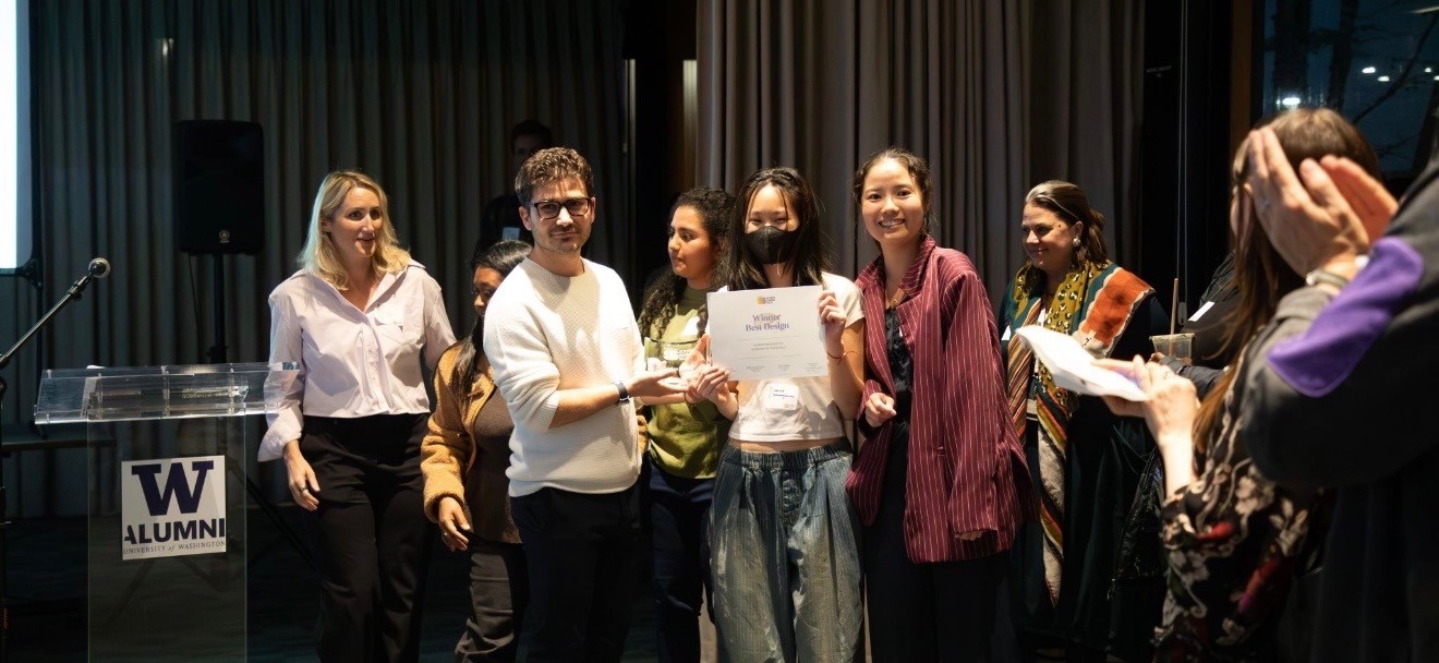
Best Design —
UW Communication Leadership Screen Summit 2026
My role
UX / Interaction Design · Product Strategy · User Research · Prototyping
Team project ·
10-week Agentic AI course
91 prototype
versions and counting
PRODUCT PREVIEW
See Nudge in motion
A walkthrough of the working prototype: scattered group ideas gathered in one place, conflicting preferences reconciled, and a shared itinerary built in a few taps.
CONCEPT EXPLORATION
We didn’t start with travel.
We explored several directions before committing to one.
Nudge began as a 10-week group project to design a software product using generative AI.
The brief was open, so our first challenge was deciding what was worth building.
Entra was our initial direction: an AI startup assistant for first-time founders.
Before committing, we pressure-tested the concept across four viability questions:
MARKET NEED
Strong — first-time founders face real friction navigating setup and operations.
DIFFERENTIATION
Weak — established products already covered much of the space, leaving no clear wedge.
COST OF ERROR
High — incorrect guidance on tax, hiring, or compliance could create real legal and financial consequences.
SCOPE
Too broad — multiple domains, changing regulations, and 50-state variation made a credible MVP unrealistic in 10 weeks.
PROBLEM FRAMING
Then two ideas started to overlap.
One teammate described how trip ideas accumulated across maps, social media, websites, screenshots, and messages until planning became overwhelming.
I had been exploring time management—and had already seen in a quick classroom exercise that the harder problem wasn’t making lists. It was deciding what deserved limited time.
Travel gave us a concrete environment where both problems could actually meet.

USER RESEARCH
Research made the problem messier.
We entered research thinking about AI-assisted trip planning for individuals. Interviews pushed us toward a harder version of the problem: groups negotiating time, budget, preferences, FOMO, and fairness—and somehow turning all of that into a plan people would actually follow.
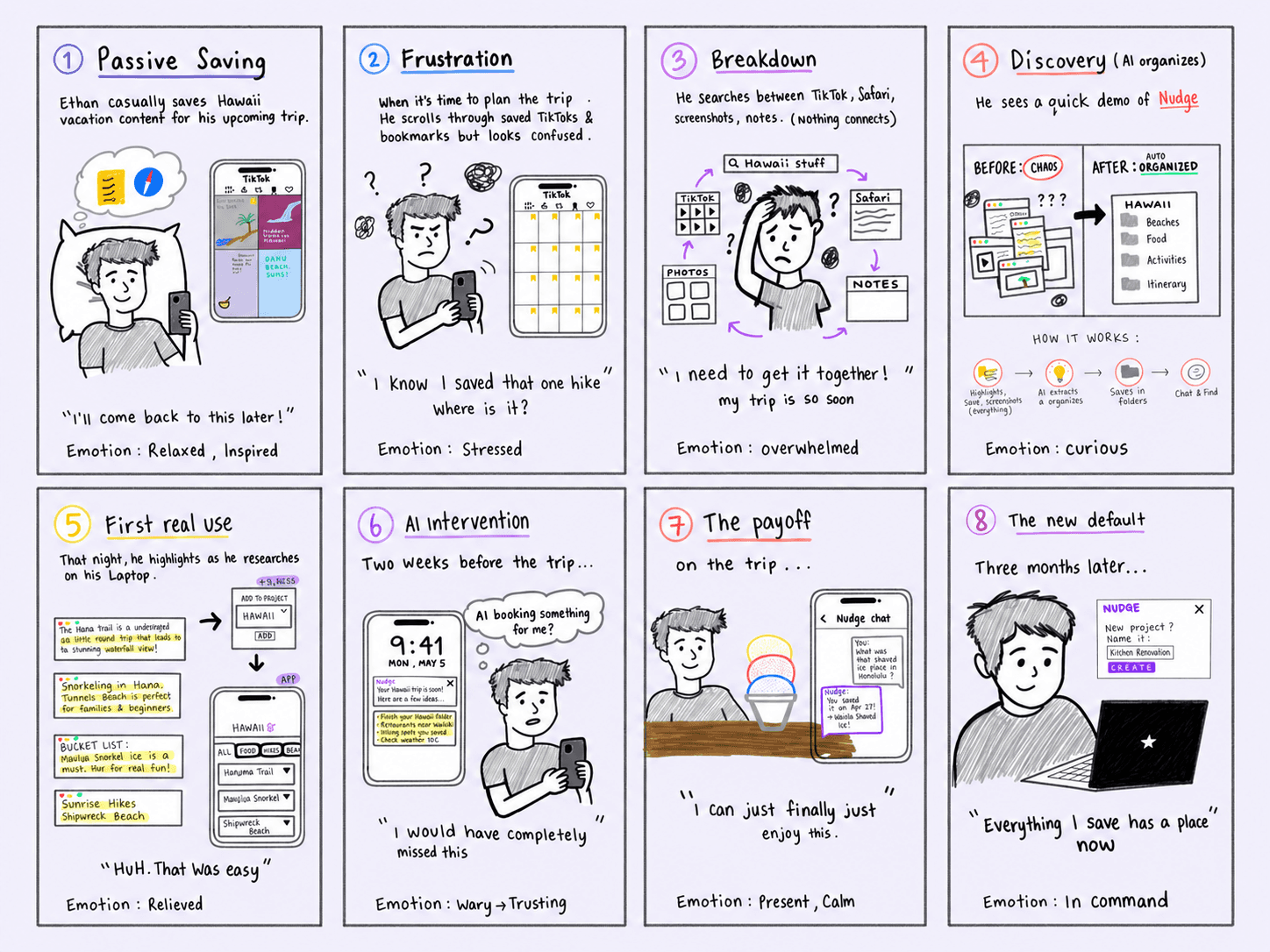
Storyboard
下面可以增加一些interview的原文
原文
PROTOTYPE DEVELOPMENT
From wireframe to tested prototype.
We mapped the core flow around three actions—capture, signal, and decide—then turned it into an interactive prototype and tested it with users.
01 — CAPTURE
How does someone introduce an option?
02 — SIGNAL
How can everyone react without adding more discussion?
03 — DECIDE
How can the group recognize when a decision is ready to be made?
Follow-up interviews surfaced new needs and points of friction. We translated those findings into another round of design changes, refining both the interaction flow and how the product responded to group decisions.
PROTOTYPE VALIDATION
We tested whether the planning flow actually worked.
Follow-up interviews surfaced new needs and points of friction. We translated those findings into another round of design changes, refining both the interaction flow and how the product responded to group decisions.
PRODUCT ITERATION
Testing the redesign through real assembly tasks
10 participants · Comparative usability test · User Manuals Only
BEFORE
2 of 5
completed assembly within 2 hours
AFTER
4 of 5
completed assembly + pre-ride check
within 2 hours
REFLECTION
Look beyond the presenting problem.
Design for the system that shapes it.
What worked — Reframing the problem
I moved beyond the manual itself and reframed the challenge as a broader onboarding and customer education problem.
What I’d push further — Design for the moment of use
I still treated the booklet format as a given. In hindsight, I would explore more scannable, task-based guidance designed around how people actually assemble the bike.
What I’d validate next — Test in the real environment
Our usability test measured task performance, and post-launch surveys captured real customer feedback. If conditions allowed, I would also observe customers assembling the bike in their own homes to uncover contextual friction that controlled testing may miss.
What I learned — Design within real-world constraints
This project taught me that UX research is not only about users. Internal research mattered just as much: understanding the constraints across manufacturing, packaging, logistics, and support helped me see why the experience existed as it did. Good UX is not designing the ideal experience in isolation. It is finding the best achievable experience within product, operational, and business constraints.